Wikipedia gets its first subtle makeover in over a decade
One of the top 10 most visited websites in the world, Wikipedia is getting its first desktop redesign in more than ten years. It is a resource utilised by billions of people each month. The Wikimedia Foundation, which manages the Wikipedia project, today announced the launch of the latest update interface aimed at making the site more accessible and user-friendly. Improvements include improved search, a more obvious location for the language switching tool, an updated header providing access to frequently used links, a revised table of contents section for Wikipedia articles, and other changes in design for a better reading experience.
List of new changes:

The alterations being made are not particularly significant; some users might not even notice them right away. However, according to the group, the change was required to fulfil the demands of the next generation of web users, including those who are more recently going online and may not be as comfortable with the internet. So, let’s see the changes:
-
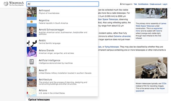
Newly improved search box:

A newly enhanced search box that helps users find the articles they need by using both images and text in its autocomplete recommendations that display as you type. Like many new changes, this one is pretty minor but provides a visual cue that can ramp up searches and make them more useful. When it was tested, the Wikimedia Foundation claimed that this modification increased user searches by 30%.
-
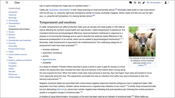
Sticky header:

Another addition is an updated sticky header, which allows you to find useful links like Search, the name of the Page, and Sections. These links follow you as you scroll down the page and stay glued to the top. This frees users to concentrate on reading or changing the material rather than having to scroll back to the top to get what they’re searching for.
-
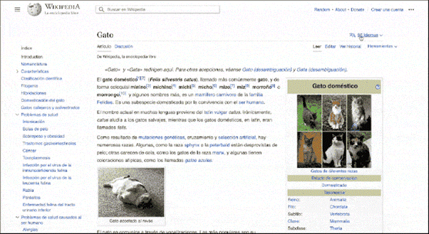
Relocation of Language-switching tools:
The ability for readers and editors to switch between the more than 300 supported languages is now provided through language-switching features that were previously present but have been mod it to a new, more noticeable location at the top right. This might be useful in developing countries where multilingual people occasionally desire to view pages written in other languages.
-
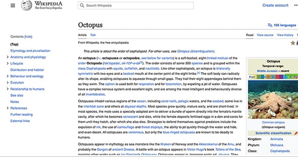
Table of contents section moves as you move:

As you scroll down the page and look for the portion you’re currently reading, you can now notice the new table of contents section on the left side of articles, which helps readers navigate through larger content. This makes it simpler to go between different sections of the article as you further explore a subject.
-
Collapsible sidebar:
The modification of the maximum line width and the addition of a collapsible sidebar for a more distraction-free reading experience. According to the foundation, keeping long-form text inside a certain range of widths increases reading comfort and information retention.
Given the extent of Wikipedia’s readership, it is obvious that the company took care to avoid making any unwelcome alterations. According to Wikipedia, there are currently more than 58 million articles available in more than 300 languages, with almost 16 billion views per month. No existing functionality was eliminated as a result of these modifications, according to the release, which emphasised that the update’s main goals were to make the site more user-friendly and modern.


