How to create a beautiful Instagram feed
For a content creator, their Instagram feed is no less than their home. A home that should be kept well, organised and beautiful.
The first and the foremost thing that any user does when they visit your profile for the first time is gently skim through your feed. It is those first few seconds where they decide if your profile is worth a follow or not.
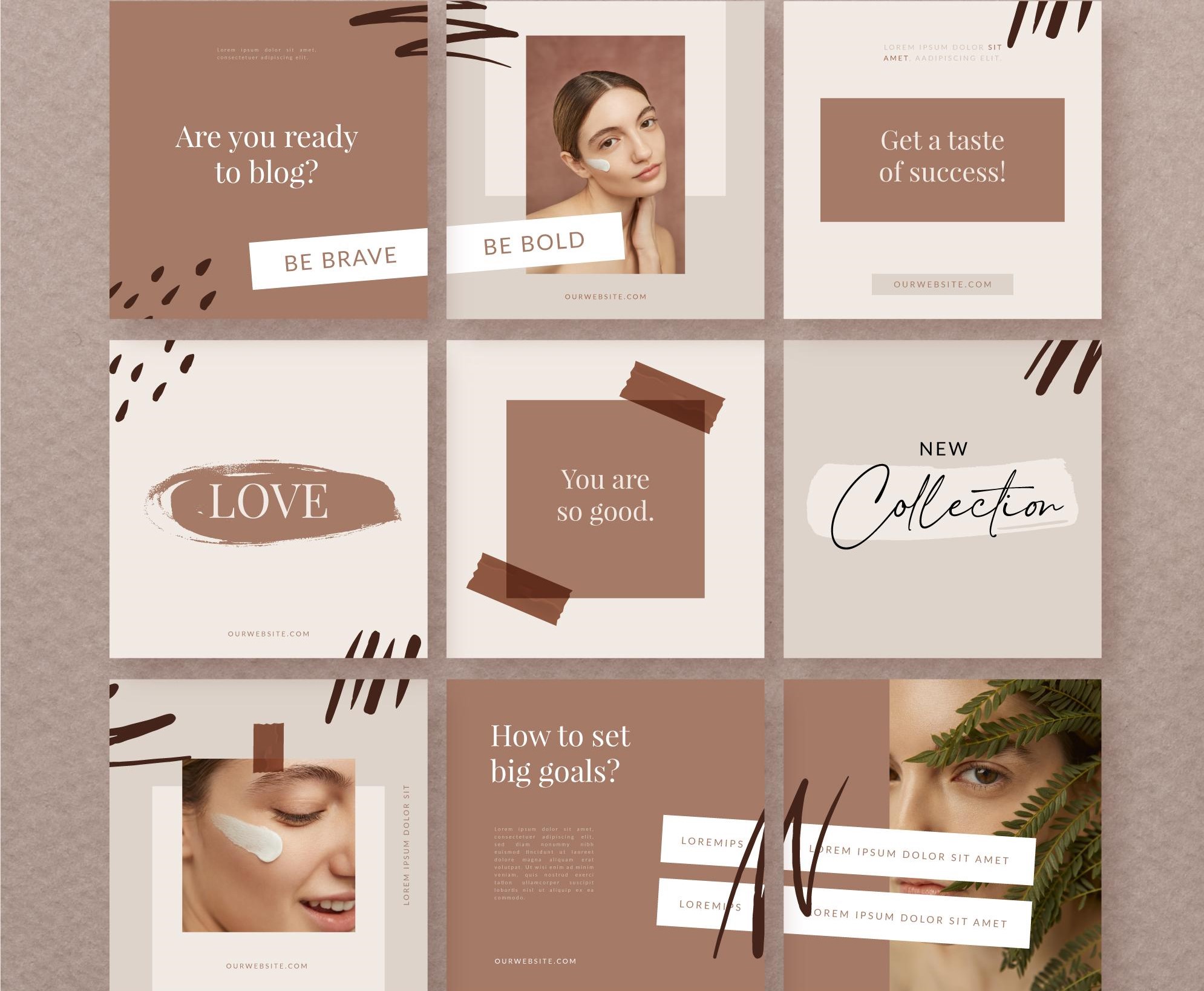
Even before they open the actual video and the post, their attention is first caught by the theme and visuals. This includes the consistency, theme, stories, posts, etc. and how they align well with the feed. The visuals presented to them hold the power to make it or break it which is why every content creator who wishes to do well and be successful in this field needs to have a beautiful and appealing feed.

How does one work on it though? What can they do to make their feed look beautiful and appealing to attract users?
Well, here are a few steps that one can follow to make their feed look beautiful-
1. Theme- Firstly, to not make your feed look all over the place or filled with clutter, make sure to have a beautiful theme set which can be done through using consistent set filters, templates or fonts. The theme can work according to your preference such as it can be bold, colourful and popping or it can also be subtle, warm and fine. It can be anything you wish but it should align well with each other as well as look visually appealing.
2. Quality- It is imperative to not compromise on quality just for the sake of posting. Any post or video that doesn’t seem like it is up to mark, fitting in well or is taking away the vibe of the feed should be removed or archived right away. Any blurry or low quality content needs to be looked over as it can definitely drive people away because of how it appears on your feed.
3. Aesthetics- Find an aesthetic that aligns well with your personality and stick to it. These could represent your niche, mood and the tone of the content. Aesthetics can be elevated by posting feel-good content and posts. Even if you’re using free stock photos to elevate your feed, do it. As long as you like it and it fits in well with the theme.
4. Plan ahead- Make sure to plan ahead of time and have a few posts and content ready so that you can first visualise it in your head. Make a rough chart of your feed and see which post would look well on which position and consistently work on the grid and the tone. Visualising it before will save you from any last minute blunders. Similarly, have a consistent stance for stories and make sure they fit in well with the theme. Your bio and profile picture plays just as important a role for enhancing your feed.
The first concern should always be posting quality content and seeing where it goes, however it is never a bad idea to have a visually appealing Instagram feed which can attract users and leave them in awe. Don’t hesitate to use different apps, ideas and research for filters and inspiration. Make sure that it looks good as well as feels good.
Related Posts

Instagram Implements Advanced Protections for Teen Users.

Instagram introduces extra protection for teenagers

Instagram Reels vs TikTok Which Platform is Better for Creators in 2024?

How Instagram Reel Views Can Boost Monetization Opportunities

Ytviews Premium Instagram Subscription Service: You’re Key to Growth


