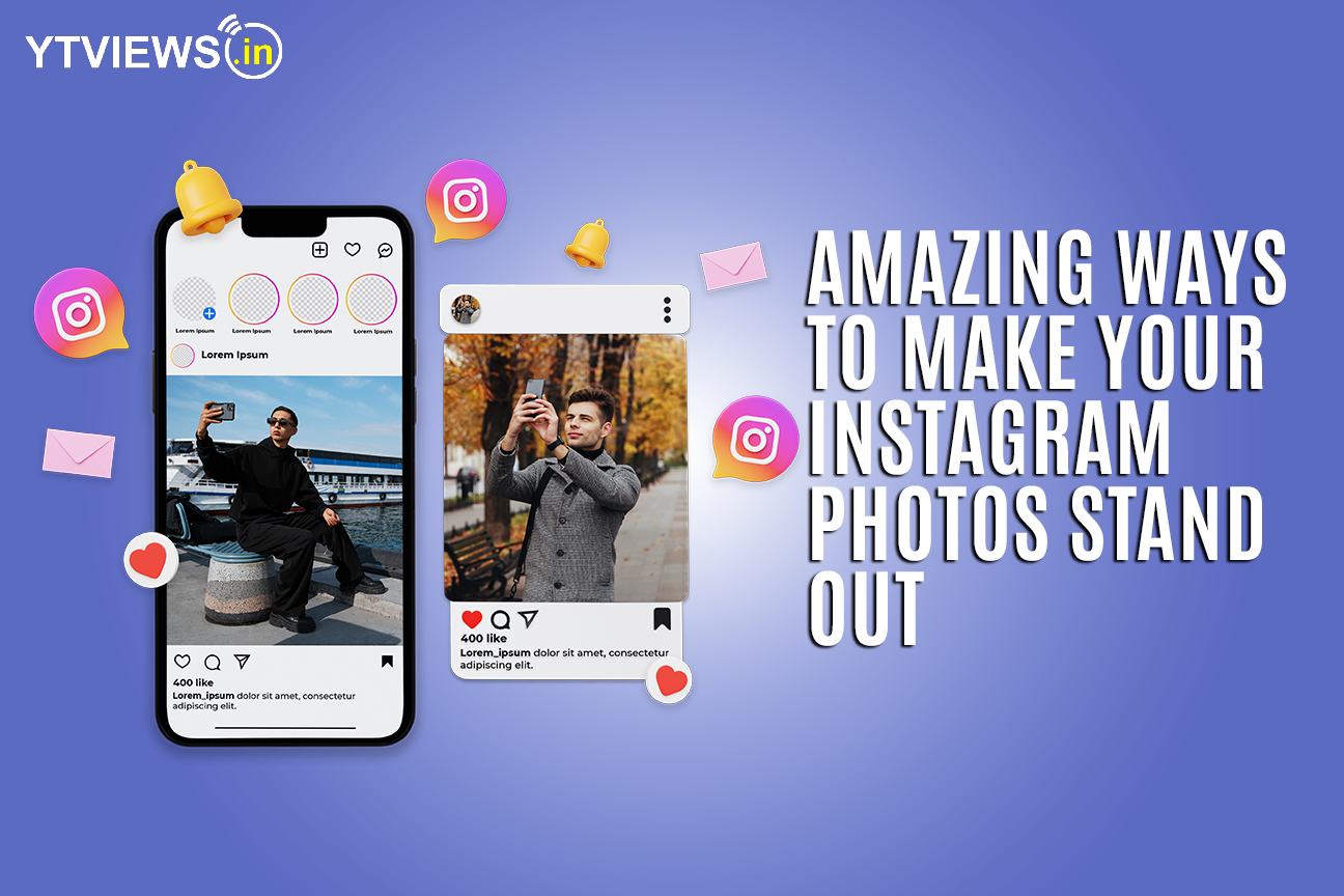
Amazing ways to make your Instagram photos stand out
 When starting out as an influencer on Instagram, people are told again and again about how they should look closely at what other, successful people are doing on the app and then more or less follow them. That advice quickly backfires when users start noticing how influencer content has all started looking pretty much the same, and don’t want to follow the same kind of pages over and over again anymore.
If you just found yourself in the same dilemma, be it as an influencer or a business owner looking to market themselves on the platform, we have you covered. If you want your instagram photos to stand out, you’ll need to shift your focus from aesthetics to some other things, like nailing mobile phone photography, doing competitor research (not to copy but to come up with better ideas), and doing consumer research if you have to.
As far as mobile photography and making your Instagram feed look flawless go, keep reading for more information about it.
Make your followers feel welcomed
When people see your profile for the first time, make them feel welcomed with a photo that’s all smiles. Even if you’re not that good at smiling, you can learn how you can easily edit a smile in a picture. This way you won’t have to put an otherwise photo in the trash either.

The thing with Instagram is that photos with faces in them do way better than photos without smiles in them – in fact, they are 38% more likely to be liked. Adding a smile to the photos with faces in them just improves your chances, so make sure you have at least a couple on your Instagram feed, and choose them over the others if you want to promote them in-app.
Think about the composition
f you’re used to taking selfies and posting them on your feed, it’ll end up looking cramped or too full. This is because you’re taking up all the space in the photos, and it’s not easy on the eyes as a whole.
Things like negative space and photo composition sound scarier than they actually are – just make sure you contrast some photos taken from a distance and throw them into the mix along with all the selfies and close ups. Think about it like this – if you’re taking a photo of a duck swimming in an empty pond, the pond is all the negative space.
Plan your feed
The thing is, you shouldn’t just be focusing on individual photos. How does your news feed look as a whole? There are tons of Instagram planners and social media management tools you can use to make sure your Instagram feed looks how you want it to.

This helps make sure that anyone who’s visiting your profile actually ends up following you instead of just passing by.
Are your photos scroll-stopping?
If you’re a young account trying to grow a following, post photos that aren’t just beautiful and engaging, but also unconventional. Think about all the content you see in your feed everyday and try to come up with content that doesn’t fit in with those photos.
From shocking colors to attention-grabbing blocks of text and unconventional graphics, there’s no end to the things that would make an average user pause.
Think about the example below:
The jarring lines, colors, and the art style in general isn’t something that you would normally see on Instagram. Not only would this photo look beautiful in a feed sandwiched between a bunch of negative space, but it’ll also catch everyone’s attention.
Related Posts

Instagram Implements Advanced Protections for Teen Users.

Instagram introduces extra protection for teenagers

How VoIP Services are changing the Way We Make Calls

Instagram Reels vs TikTok Which Platform is Better for Creators in 2024?

YouTube Develops New process To Detect AI Deepfakes.


