8 Best Email Newsletter Examples
 The email design best practices presented in this guide don’t just apply to newsletters. Apply them to your email retargeting campaigns and abandoned cart emails for the best results.
If your newsletters are great, chances are your subscribers will respond to your offers. At least you can avoid being on an email blacklist.
Learn from brands with great newsletters to boost your email marketing campaigns. Ascent shares eight amazing email newsletters you can learn from. According to Econsultancy.com’s survey, “Email continues to lead the way when it comes to delivering marketing results, with 73% of client-side marketers rating the channel as excellent, versus 72% for SEO and 67% for paid search in second and third place.
This data shows how effective email marketing strategies can be in growing a business. To help you create great email newsletters, we’ve compiled a list of powerful and carefully crafted email examples to inspire you.
Learn how to improve the quality of your email newsletters with these examples.
Here are 8 best Email Newsletter Examples for your Email Marketing Campaigns:
~ Jins
~ Away
~ Casper Labs
~ Ben & Jerry’s
~ Cook Smarts
~ Stylist Live LUXE
~ Unsplash
~ Moz
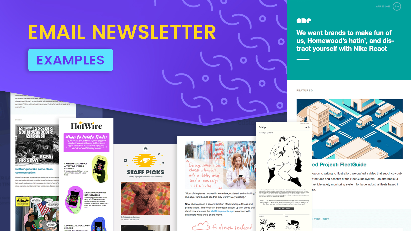
8 great Newsletter Examples that will inspire you: Get inspired by these amazing examples of email marketing from different brands.
1. JINS: The JINS email newsletter includes an easy-to-follow guide to help its audience choose the right prescription glasses. The company also provides links to relevant pages throughout the newsletter to give its subscribers quick access to important information, as well as a live chat link to style experts.
By connecting to relevant platforms or channels where your brand is present, you strengthen your integrated marketing strategy because your subscribers can interact with you across multiple channels.
2. Away: Away is an online store that designs, manufactures and sells luggage and other travel items such as backpacks and totes. In this newsletter, the brand highlights several product colours by compiling user-generated content from their social media pages.
This newsletter layout is perfect for showcasing your products and encouraging your community to engage with you. The email includes multiple call-to-action (CTA) buttons so Away subscribers can purchase the products they want without going through multiple pages.
Away also includes a recommendation option in the email to increase brand visibility.
3. Casper Labs: In one of its emails, Casper Labs reveals the science behind its product through storytelling in a problem-solving framework. The company uses simple graphics to make its content easier to understand and provide its readers with a better experience when consuming its content.
Instead of using sales-boosting phrases for its CTA button, Casper Labs invites its readers to “Learn More.” Use the Casper Labs approach to creating engaging newsletters without appearing too promotional.
4. Ben & Jerry’s: Ben & Jerry’s ChunkMail is fun and educational. It includes useful and fun information like milkshake recipes, never-before-seen facts about the company, and even tips on how to avoid freezer burn. As the newsletter has no promotional character, the company’s readers are not encouraged to be extra vigilant for fear of being sold. They might even be excited to try Ben & Jerry’s milkshake recipe, which means they have to buy their ice cream.
5. Cook Smarts: Cook Smarts sends weekly meal plans to its subscribers. The newsletter contains delicious photos of the meals. (Talk about letting the products speak for themselves.)
Plus, the Cook Smarts email is full of tips and links to helpful resources. With the value of their newsletter, their audience will surely appreciate Cook Smarts’ efforts and inspire them to support the company. The best part is the free email templates available online which you can use to create awesome newsletters like Cook Smarts.
Canva’s professional-looking email newsletter templates are perfect for the job.
6. Stylist Live LUXE: Stylist magazine’s Stylist Live LUXE newsletter uses a tone, design and layout reminiscent of fashion magazines. The email stays true to the brand image and highlights important information by placing it at the centre with eye-catching complementary colours.
Be creative with colour, but make sure your visual design doesn’t detract from your content.
7. Unsplash: Unsplash is a free image-sharing platform. Photographers share their work with media companies, marketers, and anyone looking for royalty-free images. The platform’s weekly newsletter uses a simple format with a single call to action.
Use simple backgrounds and minimal design elements to make your CTA stand out. Simple layouts also mean you can spend less time designing your newsletters and more time on other aspects of your email marketing efforts, including managing your email list.
8. Moz: If linking to external articles adds tremendous value to your newsletters, do so. While it’s ideal to create your version of the content and post it to your website, there are scenarios where this isn’t possible, especially when we’re talking about case studies.
By linking to other websites, you show your subscribers that you want to help them solve their problems. Contact the website or publisher you featured to let them know you linked to their post. This strategy is perfect for building meaningful relationships with other publishers in your industry.
Related Posts
Instagram Implements Advanced Protections for Teen Users.

5 Skills to Become a Successful Social Media Marketer

LinkedIn Adds AI Training Opt-out Option
What Video Editing Software Do Youtubers Use in 2024?

How VoIP Services are changing the Way We Make Calls
